How we empowered students to create custom study plans
Building the foundations for medical students and physicians to succeed from a Product Manager’s perspective.
Imagine you’re a medical student (less Grey’s anatomy, more IRL). You’re entering medical school after getting one of the coveted admission seats, sitting in those hallowed lecture halls on your first day. There’s so much to learn, so many facts to know, so many neural connections to make!
The average US student has to complete 4 years of med school (with many countries having up to 7 years of education) to be become a doctor, and the amount of information you need to know increases by the day. There are so many exams to pass, applications to work on, patients to see, attendings to impress, friends to make, and skills to learn.
I’ve been in those wards, rooms, and the sneakers of those students (well not literally). I know how incredibly hard it is to balance everything.
For most students, and this was 100% the case for me, the exams are the most stressful part. A large number of medical students around the world use AMBOSS for their exam preparation, and we wanted to be able to make this stressful time a bit easier for them.
AMBOSS provides a question bank (Qbank) of unique questions which test and challenge the student on the application of various concepts. There’s also a library that’s cross-linked to the Qbank. So if you get a question wrong, we know exactly which concept you got wrong, and we’ll automatically mark it up for you in the library articles. When you’re reviewing the articles, you can pay extra attention to these points. There’s a ton of other cool features as well.
When students come to AMBOSS, we know (from user research, customer support, and our market positioning) that they come to study for their exam with a score goal in mind. We want to help them reach their goal, and feel confident when exam time comes around.
Here’s how we decided what to build in order to help students create customer study plans to prepare for their exams.
Learning how students (and physicians) study
We first spoke to students from various stages of exam prep, as well as those who had finished their exams and scored well (for their studying secrets). We asked them what the biggest gap in their studying journey was, and how they solved it.
The majority of students needed help structuring their studying in order to reach their goal by the exam date. They wanted to continuously see their progress, be reassured that they were indeed getting better, and that they were staying on track for the exam. We actively spoke to students about how they currently solved this, and asked them to send in different plans so we could look at their current solutions — we saw a lot of excel sheets, documents and handwritten, post-it masterpieces.
A lot of students also asked us about how they could incorporate research-backed study methods to make their studying more efficient. Some students were already using ANKI — an open source flashcard program that uses spaced repetition. Beyond that, most students were quite confused about how recent research could actually improve their studying.
We also spoke to the amazing editorial team at AMBOSS. They’re doctors themselves, have passed these exams, and have also been involved in teaching for many years now. Speaking to them, we realized there’s a lot of research we could incorporate into the product to provide AMBOSS students with an added advantage.
After having many (many many) conversations with students and editors, some patterns began to emerge. We realized the need for structured scientific studying, which provided flexibility for each student.
Because every student, every schedule, and every exam is different, we want to empower students to make a plan that uniquely works for their lives.
It clearly needed to be custom. Rigid enough for you to not slack off, but flexible enough to adapt to unexpected life events.
This was a solid problem statement — not too narrow and not too broad. So we started looking at what the potential user experience could be.
Creating the first concepts
We first mapped various user journeys for students in different school years and study time frames leading up to the exam, and made personas with different daily schedules (this was based on our interviews and research).
For students with clinical rotations and exams every 4–6 weeks, studying was going to look very different from a second year student who has 6 weeks off to prepare for their first big exam. We also researched and sought advice from long time teachers about different scientifically proven study techniques.
Based on all of this information, we created four concepts of what study plans could look like.
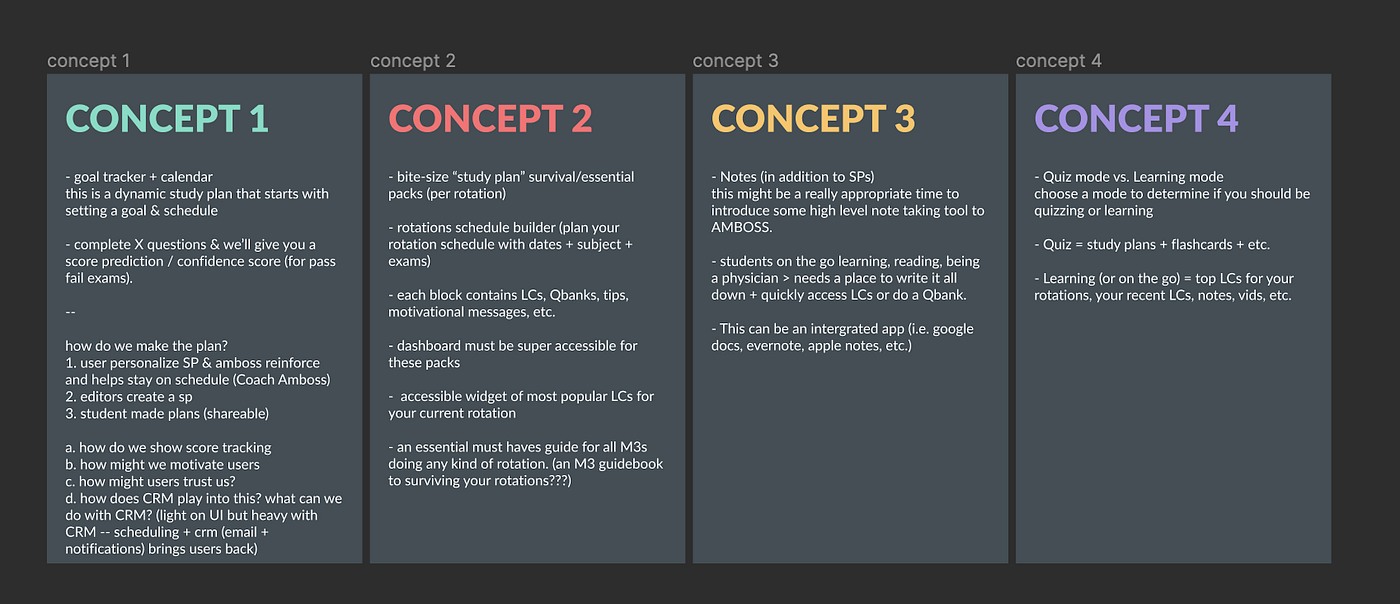
I think in the end it ended up being a mixture of a few of these concepts, but having them defined like this helped structure our thoughts at that point in time, and ultimately helped us proceed.
The importance of random order
These studies from Human Kinetics, a company that provides information related to physical activity, explains how doing tasks (or questions in this case) in a random order (B-C-D-G-Q instead of A-B-C-D-E) can aid better learning, application, and memory retrieval.
Here are my takeaways from that article for those who want a quick summary:
- Random practice forces the learner to become more actively engaged in the learning process by preventing simple repetitions of actions.
- Random practice gives the learner more meaningful and distinguishable memories of the various tasks, increasing memory strength and decreasing confusion among tasks.
- Random practice causes the learner to forget the short-term solutions (from working memory) to the movement problem after each task change.
- Forgetting the short-term solution forces the learner to generate the solution again on the task’s next trial, which is beneficial to learning.
Applying this to medical education, we inferred that studying subject by subject could be compared to learning in a specific order. This is also why exam questions are in a random order. We decided it makes more sense to study questions in a random order to mimic the exam experience.
Turning our concepts and insights to wireframes
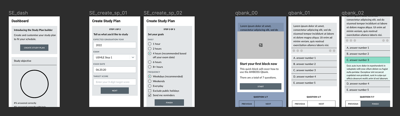
Based on these findings and concepts, we started creating wireframes.
Before beginning the wireframes, we came up with 4 themes that needed to be addressed throughout all of them:
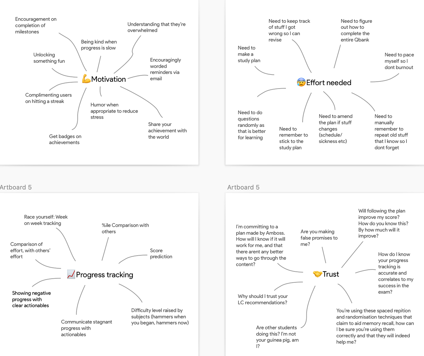
In early designs, we made our prototypes in low fidelity to focus on the user flows and information hierarchy rather than the interface.
We followed basic design principles and kept the flow clean and simple, providing a few important (but not too many) choices. With every choice, the user’s cognitive load went up and we wanted students to save all their cognitive power for their studying, not to figuring out our interface!
But taking out choices, meant backing every decision with a lot of data. We had to decide what most students need, and what represents an edge case.
Sometimes, the easiest thing a PM or designer can do is provide all the choices and allow the user to figure it out for themselves. And while a few power users may really enjoy all that choice, for most users it can get incredibly daunting.
There are so many products whom I’ve abandoned mid set up, telling myself I’d do it tomorrow (since I’m really tired today). And often we don’t even get back to it, because we all know tomorrow never really comes.
💡 Read more: How UX designers can work with data.
From wireframes to MLP
It became clear we would need a few things in the minimum viable version:
- We needed a custom plan. One size doesn’t fit all.
- We needed a plan with questions in random order (as this better mimicked the exam, and was also substantiated by research).
- Especially because of point 2, students needed to track if they were indeed covering the entire curriculum (and not only focusing on a few disciplines — since the questions were in random order, this was hard to discern).
- We needed a simple way to make a plan, providing choices that were relevant to most students.
- We needed to motivate students as they progressed.
- We needed flexibility for when days don’t go as planned and students need to catch up or jump ahead in their prep.
- We always wanted students to be able to pick up easily, even if they missed a few days or weeks, and we wanted to make sure they still could feel motivated. One setback shouldn’t mean the end of their preparation.
- We wanted to show students their progress, but never have it overwhelm them. In the early days progress is hard earned, and we always wanted to show that effort is always beneficial. It’s important that students don’t lose heart and stop before that.
Having these clear points made it easier to come up with the prototypes and product copy.
Once we were feeling good about our designs, we had a round of feedback from editors, marketing, other designers, customer support, and our sales team.
Each meeting gave us insights that we didn’t previously know, and our designs got tweaked slightly (for the better we hope!). We were one step closer to the final designs.
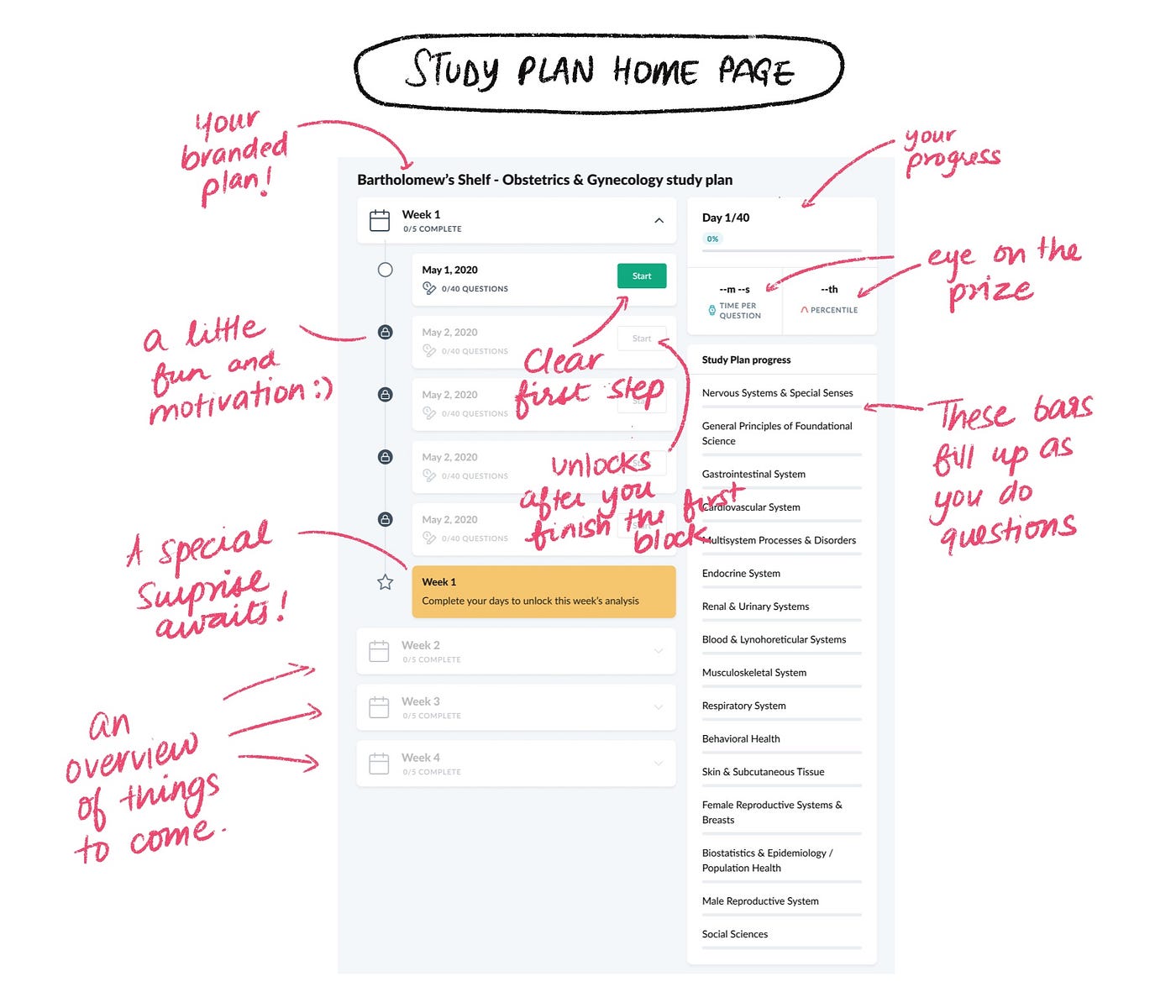
Here are the final designs
The annotations relate to the above mentioned points and how they were applied:

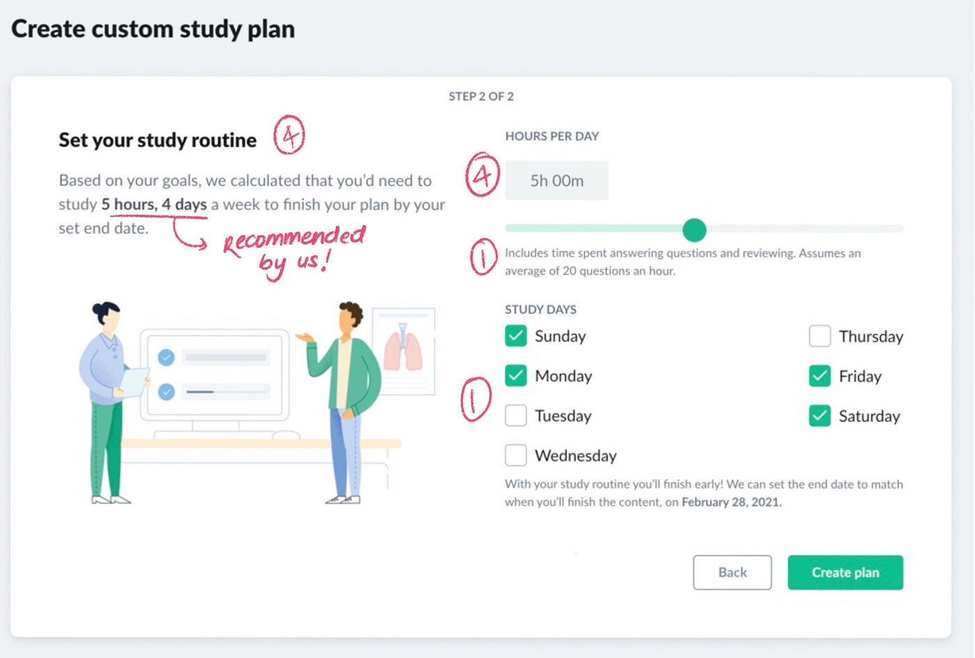
We want to build a lot more customization over time into the study plans. We know that not everyone will be able to fully utilize a plan based on these few filters. We also want to add more options to filter based on curriculum, specific systems, and add the ability to change the plan on the fly.
But first, the plan had to exist, and students needed to use it. We focused on creating a Minimum Lovable Product, or MLP — a strong foundation on which we could build more customization for our students later.
Once students provided their information and study requirements, we could make a custom study plan for them. Below are the final designs for the Plan overview page.
This is where our beloved students would (hopefully) be spending a lot of their time, so we designed each section with care:
Measuring and motivating students using progress
I especially want to tell you how we designed the Study plan progress section.
When I started studying for an exam (and I believe this is true for a lot of students), I knew that on the first day I probably wasn’t going to hit it out of the park.
Seeing a whole lot of red (signifying wrong answers) probably isn’t going to increase motivation either. So while students are chipping away at their plan, they’ll also see their progress go up.
The second reason we have this here is to assure students that they are indeed covering all their subjects, which may not be evident to them since the questions are in random order.
Once students are comfortable with their study plans and using them regularly, they’ll ‘unlock’ some other cool stuff we’ve built.
- When students complete a session, we recommend articles we think they should skim. These are intelligent recommendations that are unique to their performance in the session.
- Once they finish a session, reviewing it is key (this was a tip from one of our top teachers)! Reviewing is how you learn and remember information. We want each student to make the most of each question.

If students have done all their sessions for that week, they unlock our shiny Weekly achievement at the end of each week! We wanted them to take the time to review and dive into the analysis for each day. It’s that moment to take a breather, get that cup of coffee or tea, and feel good about all the hard work they put in.
Finding the right workflow
As we geared up to make this project a reality, instead of working in agile (taking a few tickets at a time), we decided to treat it as waterfall (viewing the initiative as a whole). Doing this helped us plan across sprints and set up a solution design document.
This not only documented the ‘how’ of the project, but also the order of the tickets we then worked on. Having this document as a guide helped the team zoom in and out of individual tasks, and look into how these shaped the overall feature.
Starting in Beta
We released this feature first in Beta and surveyed users to get more detailed insights into their experiences and suggestions.
Our students really liked it overall, so we released custom study plans to everyone over time. Students really loved it, and we soon had lots of requests and optimizations specific to their certain exams and schedules. We love hearing back from our students, and we’re constantly noting down suggestions to improve.
Reflections on learning
Building the product for students to create custom study plans was a hugely rewarding experience. Here are some of my biggest learnings from working on this project:
- Try as we may, we can’t build a perfect feature for everyone with limited time and resources. Building what works for most, is a good way to test the concept before investing more into the initiative and scaling up.
- In user research, we always talk to the consumer. But also talking to teachers gave us great insights into how learning happens from both sides of the classroom. We were able to integrate these learnings into the feature.
- Keeping the cognitive load down is key! It’s the equivalent of having all the options in a massive grocery store, and it being a large (and potentially exhausting) journey to find what you want. Reducing it to a mom and pop shop, which you can quickly pop in and out of, with most of what you need easily available.
- Keeping the abstraction level high (at a jobs to be done level) is a great way to guide design decisions. Having a visual representation (mind mapping) really helped us to always remember what we were solving for.
- Low fidelity designs built for mobile forced us to put only the relevant information on the screen. Making designs for desktop sometimes gave us a lot of freedom and space, which we later realized just didn’t translate well to mobile. Going the other way around is hard at first, but can be quite liberating as you proceed.
- Build imperfect but realistic mockups. A lot of our mockups are always the best case scenarios. On the analysis page, everything looks green to a student doing moderately well. However, even that student didn’t have that experience when they started. The decision to show wrong answers in red, and emphasizing progress (over effort) can lead to demotivation quite quickly. Mocking up how something may look for someone who is just at the beginning of their studying helped us reduce or remove what could be potential ‘punitive’ user interface experiences.
- Waterfall is sometimes the best Agile. Imbibing the spirit of agility, being agile to change work methodologies based on the project needs, was more beneficial to us than sticking to agile practices. Too many changes can lead to chaos over time. But for this project, and for our team, this worked out quite well.
I hope you enjoyed reading through our journey of creating the custom study plans feature for our students!
If you have any thoughts, questions or suggestions, please don’t hesitate to leave a comment below, or reach out to me on LinkedIn.
Thanks to Hannes Rössler